The aim of this unit is to develop understanding of and skills in research relevant to creative media production. Learners will present their findings in both written and oral forms and will learn how to cite and reference their sources. Learners will also develop their knowledge of, and practical skills in photography. Learners will investigate different areas of photography, such as promotional, advertising and photojournalism, and produce and reflect on their own practical examples of photographic work.
You are required to produce a photo-shoot for your client that will showcase your learning within the field of photography. This will also give you the opportunity to show off your chosen style of photography and chosen photographic aspect. You will need to provide extensive research in your sketchbooks/blogs that have lead you to your final photographic album and style. You are free to experiment and could produce photography that has then been digitally or hand manipulated using Illustrator or Photoshop or use a photograph that has just simply been edited.
Part 1 - Photoshop Tutorials
The first part of my blog is dedicated to showcasing and showing off the tutorial I have completed in class. This is also a chance to show off my ability and what I'm capable of doing in photoshop.
The following tutorials have been complete and added to this segment:
The following tutorials have been complete and added to this segment:
- Creating a splatter effect
- Creating a ghostly apparition
- Creating a piece of pop art comic book text
- Creating 'sparkle' brush in photoshop
- How to Solarize images
- Creating a Rainbow selfie
- Creating a ministry of sound album cover
- Replicating Kemp Folds
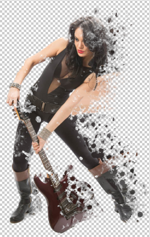
Creating a Dispersion/Splatter Effect
Splatter effects can be used in multiple ways, they're a nice effect for advertising if you're advertising something liquid based but they can also be applied to a person to create the effect of motion or a way to stylise the poster or image in a way perceived as cool.
To create a dispersion/splatter effect on your subject, we'll be using a number of different techniques and tools, some of these include the liquify tool, layer masks and the use of custom brushes.
Step 1 -
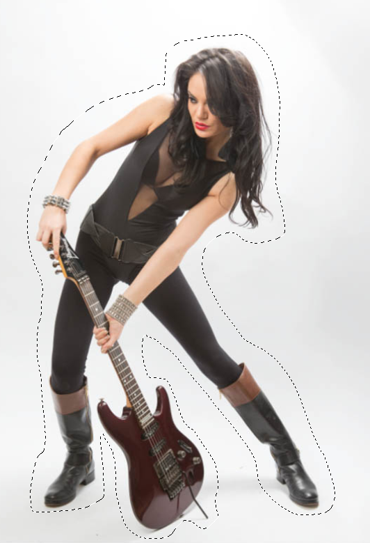
In my first step I'm going to assume you already have a picture of someone or something ready, make sure the picture is behind a white background though, or you're going to have a hard time cutting it out.
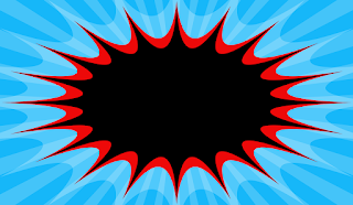
Paste the image into a blank canvas or open it with photoshop. Once this is done, use the lasso tool to cut out the image, just simply go around the subject in your photograph like shown here. Or you can use the magic wand tool to do this but make sure you alter and play with the tolerance depending on the resolution of the image and if the image has a white background. Also make sure that "Contiguous" along the top bar when your wand tool is active, is ticked.
Step 2 -
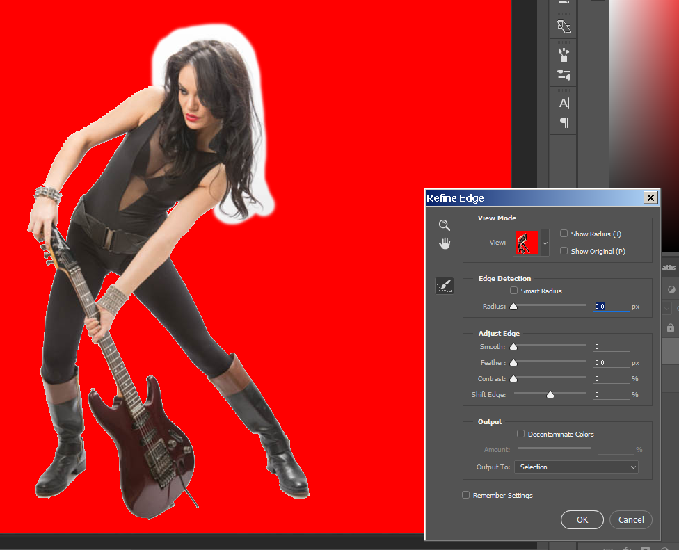 With the ant trail around your subject, invert the selection by going to Select>Inverse and then click on refine edge. whilst doing this, draw around the hair of your person. This will make it look nicer once you finalise your decision.
Place your subject into background if you have one and then resize it to your liking. In my case, none of this needs doing so I'll just leave it as it is.
Convert the layer of your a smart object, which if you've been following and reading through this blog. You should know how to do, if not, select the layer of your subject and on the layers tab, click the icon on the top right of the tab. This will give you a drop down menu in which you can choose "Convert to smart object".
After this, duplicate the layer naming the bottom one to liquify.
Step 3 -
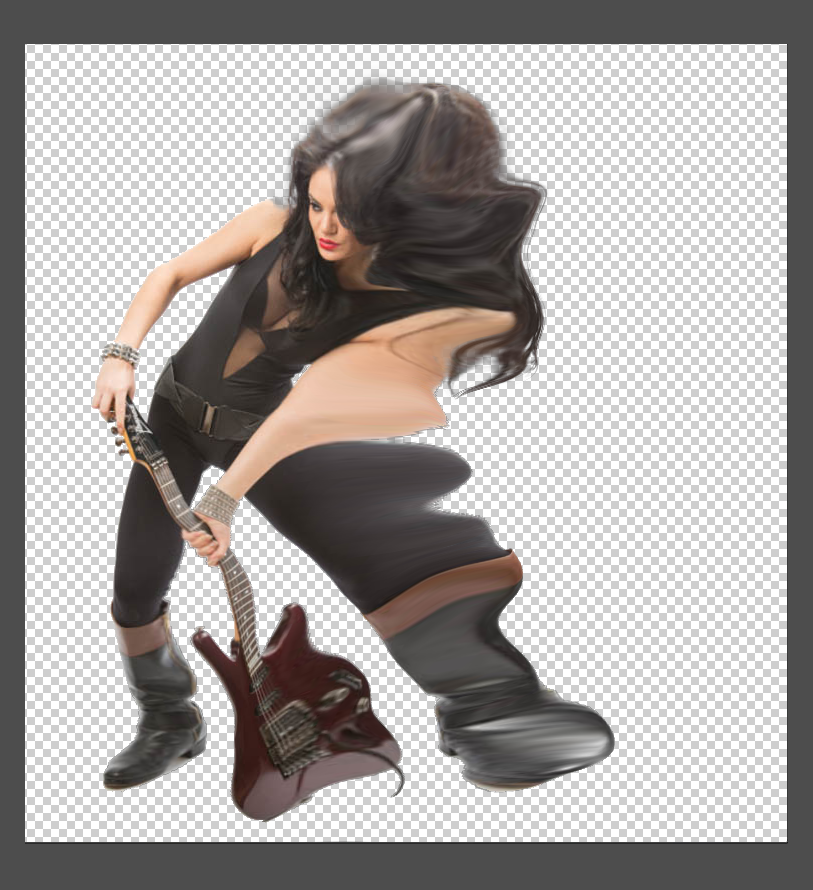 Open up liquify on the correct layer by going to Filter>Liquify, in here, we'll be using the "forward warp tool". Our goal is to drag out the edges of our subject using it to create a distorted and stretched out looking image of our original. It should look something like this.
Once this is done, add a layer mask to it by clicking on the layer mask icon at the bottom of you're layers tab, next to "fx".
Now invert this layer mask by pressing either CMD+I or CTRL+I. Now when you cover the layer mask with black, it'll cover the layer whilst adding white to the layer mask, it'll show parts of the layer you draw on.
 Add another layer mask to your original, un-liquified image as well.
Step 4 -
Step 4 will use custom brushes of paint splatters, the brushes I'll be using can be found at: https://db.tt/NH8Hh7hO - This link was taken from the tutorial we had to follow to creat the video.
Install the brushes in to photoshop, you should be able to just double click and open them where they will install themselves into the program. With the brushes installed, use them to start covering up your original images layer.
Now you're ready for step five which will teach you how to use our liquified layer to create a dispersion effect with our splatter brushes.
Step 5 -
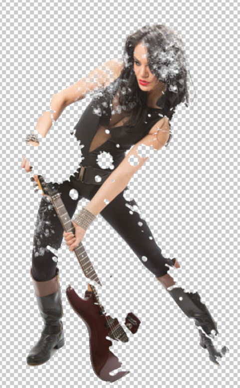
Like you did on the above layer, on the liquified layer, do the same but make you're you invert the foreground and background colours. Using the splatter brushes, go over your image and you'll notice some of it comes back. Go around everywhere you stretched out when liquifying to create the splattered effect.
Final Image -
To create a dispersion/splatter effect on your subject, we'll be using a number of different techniques and tools, some of these include the liquify tool, layer masks and the use of custom brushes.
Step 1 -
In my first step I'm going to assume you already have a picture of someone or something ready, make sure the picture is behind a white background though, or you're going to have a hard time cutting it out.
Paste the image into a blank canvas or open it with photoshop. Once this is done, use the lasso tool to cut out the image, just simply go around the subject in your photograph like shown here. Or you can use the magic wand tool to do this but make sure you alter and play with the tolerance depending on the resolution of the image and if the image has a white background. Also make sure that "Contiguous" along the top bar when your wand tool is active, is ticked.
Step 2 -
With the ant trail around your subject, invert the selection by going to Select>Inverse and then click on refine edge. whilst doing this, draw around the hair of your person. This will make it look nicer once you finalise your decision.
Place your subject into background if you have one and then resize it to your liking. In my case, none of this needs doing so I'll just leave it as it is.
Convert the layer of your a smart object, which if you've been following and reading through this blog. You should know how to do, if not, select the layer of your subject and on the layers tab, click the icon on the top right of the tab. This will give you a drop down menu in which you can choose "Convert to smart object".
After this, duplicate the layer naming the bottom one to liquify.
Step 3 -
Open up liquify on the correct layer by going to Filter>Liquify, in here, we'll be using the "forward warp tool". Our goal is to drag out the edges of our subject using it to create a distorted and stretched out looking image of our original. It should look something like this.Once this is done, add a layer mask to it by clicking on the layer mask icon at the bottom of you're layers tab, next to "fx".
Now invert this layer mask by pressing either CMD+I or CTRL+I. Now when you cover the layer mask with black, it'll cover the layer whilst adding white to the layer mask, it'll show parts of the layer you draw on.
Add another layer mask to your original, un-liquified image as well.Step 4 -
Step 4 will use custom brushes of paint splatters, the brushes I'll be using can be found at: https://db.tt/NH8Hh7hO - This link was taken from the tutorial we had to follow to creat the video.
Install the brushes in to photoshop, you should be able to just double click and open them where they will install themselves into the program. With the brushes installed, use them to start covering up your original images layer.
Now you're ready for step five which will teach you how to use our liquified layer to create a dispersion effect with our splatter brushes.
Step 5 -
Like you did on the above layer, on the liquified layer, do the same but make you're you invert the foreground and background colours. Using the splatter brushes, go over your image and you'll notice some of it comes back. Go around everywhere you stretched out when liquifying to create the splattered effect.
Final Image -
Creating a Ghostly Apparition
Creating a Ghostly Apparition is a tutorial made by BlueLightningTV in which we turn a portrait photograph of someone, into an eerie looking ghost using photoshop and its various techniques like using smart objects via the text tool as well as adjustment layers.
 To start creating the ghostly apparition, I chose a portrait photograph with a dark or black background. We use the dark background to give that sense of depth of that the person is perhaps deep down somewhere or hidden but also this will make what we do later, stand out a whole lot more.
From here, we then add an adjustment layer. Clicking the adjustment layer icon, we then select "Curves". Now select the portrait image of the person you want to make into a ghost so that its active.
After this is done, head to the pait brush tool and create a brush that has 0% hardness and the opacity of the brush 100%.
Make sure your foreground and background colours are both black and white. If they aren't, this can be done by hitting "D" on your keyboard or changing them manually if you so wish.
Now we need to add a quick mask, the quick mask is located just below your foreground and background colour and clicking this will prompt up a box.
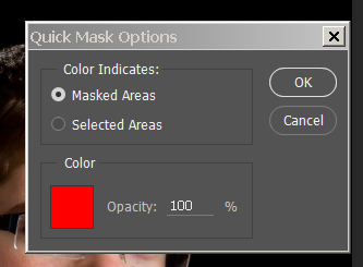 Make sure your opacity is 100% and "Masked Areas" is selected. After this, you can just click "OK" and move onto the next part.
Click the quick mask button once again and reducde your brush size and then brush over the iris' of your persons eyes but do not go over any white of the eye.
Press Q to make the mask a selection, now click on the layer mask to make it active and press ALT+Delete to fill the selection with black.
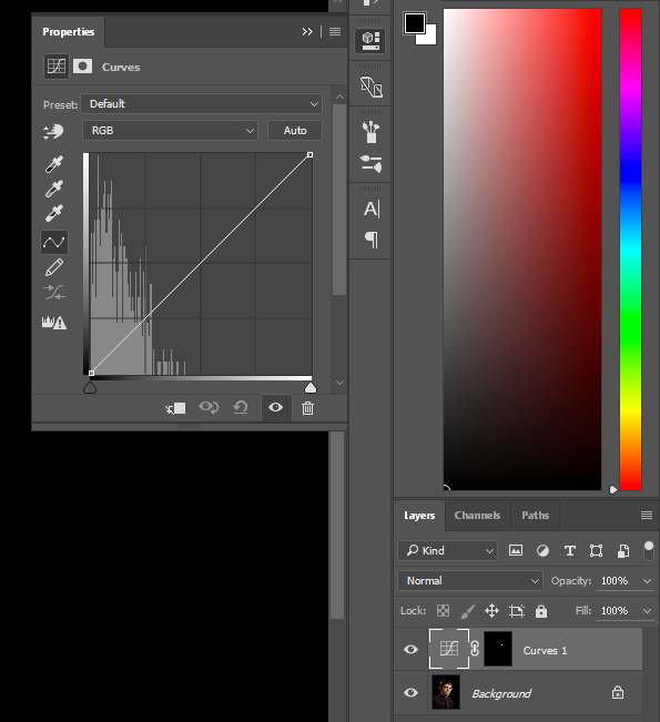
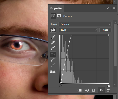
Our next step is to click on the Cureve icon in your layers tab. Doing this will open the following:
Click on the first icon underneath "Preset:" and colour pick a part of the person eye that has medium brightness. A small point will now appear on the graph to the right of your image, this point represents the brightness of the eye we just selected.
Now drag your cursor all the way up unti the line inside the curves graph becomes straight at the top before heading diagonally downwards. This will incread the brightness in the eyes dramatically and also only effect the eyes because of the quick make we made earlier and transformed over onto the curves adjustment layer.
 Once this has been done, click on the adjustment layer icon at the bottom of our layers tab, like we did to add a curves layers but this time select "Hue/Saturation".
Reduce the saturation to -100/all the way to the left and then take a composite screenshot using "CTRL+SHIFT+ALT+E" on Windows or Command+Shift+Option+E on Mac.
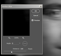 Next we need to make a copy of the screenshot we just took, with the layer of the screenshot selected, press CMD+J or CTRL+J and this will duplicate the layer. We're going to blur this layer so head to Filter>Blur>Motion Blur and change the angle to 0 degrees as well as the pixels to 100. You should keep in mind though, that the distance amount will depend on your image and its resolutions, play around with it until something works for you.
We want to restore some of the face in this image and especially the eyes so to do this on the blurred layer we create a layer mask using the icon at the bottom of the layers tab with the layer active.
With the brush tool still open, increase its size using the "]" key, this will steadily increase its size the longer you hold it.
Gently brush over the subjects face to restore some of it but remember to lower the size of your brush and go over the eyes to refine the eyes even more. We'll then create another composite snapshot of the image like done earlier using "CTRL+SHIFT+ALT+E" on Windows or Command+Shift+Option+E on Mac. This layer will be edited using a diffuse glow, so name it that appropriately if you want to.
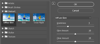 To Diffuse Glow on this layer, head to Filter>Filter Gallery and once inside that, open up Distort>Diffuse Glow. The three sliders on the right are what we'll be playing with, the first one affects how grainy the image will like, the second change the amount of glow and the last slider changes how much space the glow covers. These are the values used in my own work.
 This looks great and the image is really coming along now, but it could use some extra colour to make it really stand out against the grainy black. Select a new adjustment layer at the bottom of your layer tab and select "Solid Colour".
Now we need to select a colour for our image to have, in the tutorial followed we use the values-
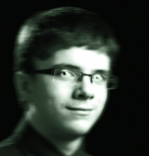
This is our finished finished image of the ghostly apparition, later on in the tutorial it teaches you how to add some creepy text to your work but i felt this was uneeded in my own work because of no suitable place to put it. Regardless, here is a version with the text added the best i could fit it.


From here, we then add an adjustment layer. Clicking the adjustment layer icon, we then select "Curves". Now select the portrait image of the person you want to make into a ghost so that its active.
After this is done, head to the pait brush tool and create a brush that has 0% hardness and the opacity of the brush 100%.
Make sure your foreground and background colours are both black and white. If they aren't, this can be done by hitting "D" on your keyboard or changing them manually if you so wish.
Now we need to add a quick mask, the quick mask is located just below your foreground and background colour and clicking this will prompt up a box.
Click the quick mask button once again and reducde your brush size and then brush over the iris' of your persons eyes but do not go over any white of the eye.
Press Q to make the mask a selection, now click on the layer mask to make it active and press ALT+Delete to fill the selection with black.
Our next step is to click on the Cureve icon in your layers tab. Doing this will open the following:
Click on the first icon underneath "Preset:" and colour pick a part of the person eye that has medium brightness. A small point will now appear on the graph to the right of your image, this point represents the brightness of the eye we just selected.
Now drag your cursor all the way up unti the line inside the curves graph becomes straight at the top before heading diagonally downwards. This will incread the brightness in the eyes dramatically and also only effect the eyes because of the quick make we made earlier and transformed over onto the curves adjustment layer.
Reduce the saturation to -100/all the way to the left and then take a composite screenshot using "CTRL+SHIFT+ALT+E" on Windows or Command+Shift+Option+E on Mac.
 Next we need to make a copy of the screenshot we just took, with the layer of the screenshot selected, press CMD+J or CTRL+J and this will duplicate the layer. We're going to blur this layer so head to Filter>Blur>Motion Blur and change the angle to 0 degrees as well as the pixels to 100. You should keep in mind though, that the distance amount will depend on your image and its resolutions, play around with it until something works for you.
We want to restore some of the face in this image and especially the eyes so to do this on the blurred layer we create a layer mask using the icon at the bottom of the layers tab with the layer active.
With the brush tool still open, increase its size using the "]" key, this will steadily increase its size the longer you hold it.
Gently brush over the subjects face to restore some of it but remember to lower the size of your brush and go over the eyes to refine the eyes even more. We'll then create another composite snapshot of the image like done earlier using "CTRL+SHIFT+ALT+E" on Windows or Command+Shift+Option+E on Mac. This layer will be edited using a diffuse glow, so name it that appropriately if you want to.
 To Diffuse Glow on this layer, head to Filter>Filter Gallery and once inside that, open up Distort>Diffuse Glow. The three sliders on the right are what we'll be playing with, the first one affects how grainy the image will like, the second change the amount of glow and the last slider changes how much space the glow covers. These are the values used in my own work.
 This looks great and the image is really coming along now, but it could use some extra colour to make it really stand out against the grainy black. Select a new adjustment layer at the bottom of your layer tab and select "Solid Colour".
Now we need to select a colour for our image to have, in the tutorial followed we use the values-
- Red - 23
- Green - 106
- Blue - 35
This is our finished finished image of the ghostly apparition, later on in the tutorial it teaches you how to add some creepy text to your work but i felt this was uneeded in my own work because of no suitable place to put it. Regardless, here is a version with the text added the best i could fit it.

Creating a piece of Comic Book Pop Art
In this tutorial, I create a comic book piece of text in a pop art sort of style. This is done using shapes and smart objects to create a background in which bright coloured text can rest on top of, together, this creates a nice pop art comic book piece which can be applied multiple pieces of work.
 Our first step is creating the background, I have chosen a nice shade of blue with the values of:
The next step uses shapes, the shape tool is found near the hand and path selection tool, from here we want a custom shape so click and hold down on the shape tool and then click "Custom Shape Tool".
From here, along the top toolbar, we can click the current shape selected and choose a different one. The shape we want though is different to the ones displayed. Click the small cog wheel on the drop down menu and another one will appear. After this, click on "symbols" and then "Append".
 The shape we're looking for is "Registration Target 2", now we need to set the the colour of the shape. We'll be using a colour similar to the background but a bit lighter at these values:
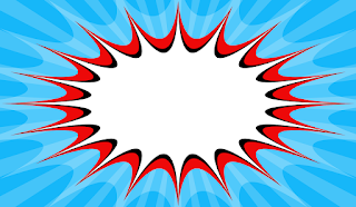
Now place your cursor in the middle of your canvas with the shape tool active and drag outwards till it goes past your entire canvas and gives the effect shown here. This is great and now we can move onto the next stage of creating this piece of comic book pop art.
Create a new layer and click on the polygon tool, now click on the fill colour box at the top task bar. Select white for your colour (drag or click your cursor into the top left of the colour palette) and then hit "OK". Now click on the middle of your canvas and a box will appear, enter the width and height of your document in their respected boxes and then tick on "Star" and "smooth Indents", you'll also want the "Indent Sides By" to be 60%.
Once these have been checked, type in the number of sides you want, in this particular tutorial we use 20 sides. The shape will be off to the side but we'll deal with this later once we've made all the shapes, so for the time being just make the opacity of this layer at 25%.
To make the other shapes fit into the one we just created, we need to transform it and make it bigger, we can do this by clicking the transform tool and then clicking the small chain link between the width and height of the shape. When we do this, both the width and height will adjust in unison. Type for the width to be 125% and the height will adjust with it. This is fine and we can now create our new shapes.
 What was done before is just repeated again now but this time we use a different colour. Use the polygon tool and open the colour picker like we did for the white shape. Enter these values:
 Now click on your canvas once again but instead, this time change your "Indent Sides By" to 70%, this applies it so the red is inside of the lowered opacity white shape but both layers are still visible. The next step in this tutorial are basically a repeat of what we've just done once again.
This time though, fill your colour picker with solid black, click the canvas and set your "Indent Sides By" to 90%. It achieves the same effect as we did last time and we're almost done in creating a background now.
 Our last shape will be the colour white, so as usual, with the polygon tool being used, click on the fill colour picker at the top taskbar and select white. Click on the canvas once again and now indent the sides by 99% This gives use this desired effect.
Yours may not look like this and they may be off to the side, you can fix this by simply highlighting all the layers, clicking the move tool and then by clicking the "Align horizontal centre icon" and then the "align vertical centre icon". This will place it into the centre of your canvas.
Group all the shapes into a folder if you like but this isn't exactly needed, only if you want to keep everything neat or will be using this for later use or changing.
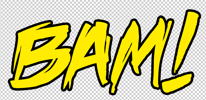
The next and last few steps are really simple and quick, this part entails adding the text over the shapes we've created. First, find a font that you like, in this piece i am using the "Death Rattle" font which can be found here: http://www.dafont.com/deathrattle-bb.font
Now we need to select the font with our text tool and then write whatever we like or desire, I'm going to write "BAM!". Make this text pure yellow by using the colour picker or typing these values:
This is nice but we want it to stand out, we can do this by applying a blending option. Right click the text layer and select "Blending Options...", now tick the "Stroke" section and set the size to your liking but also make sure it's on the outside and not the inside of the text.
Perfect! But it doesn't look much like the pop art we're used to. We can remedy this issue with a simple filter technique. Head to Filter > Pixelate > Colour Halftone and then convert the text into a smart object when prompted to, another box will now appear but you will be keeping the default settings on this box.
Scale and rotate your text how you like inside your self-made background and maybe even resize and play with some of the letters in your text. Here is my finished result.

 Our first step is creating the background, I have chosen a nice shade of blue with the values of:
- Red - 22
- Green - 183
- Blue - 249
The next step uses shapes, the shape tool is found near the hand and path selection tool, from here we want a custom shape so click and hold down on the shape tool and then click "Custom Shape Tool".
From here, along the top toolbar, we can click the current shape selected and choose a different one. The shape we want though is different to the ones displayed. Click the small cog wheel on the drop down menu and another one will appear. After this, click on "symbols" and then "Append".

- Red - 68
- Green - 196
- Blue - 249

Now place your cursor in the middle of your canvas with the shape tool active and drag outwards till it goes past your entire canvas and gives the effect shown here. This is great and now we can move onto the next stage of creating this piece of comic book pop art.
 | |
| When centred, it'll look like this |
Once these have been checked, type in the number of sides you want, in this particular tutorial we use 20 sides. The shape will be off to the side but we'll deal with this later once we've made all the shapes, so for the time being just make the opacity of this layer at 25%.
To make the other shapes fit into the one we just created, we need to transform it and make it bigger, we can do this by clicking the transform tool and then clicking the small chain link between the width and height of the shape. When we do this, both the width and height will adjust in unison. Type for the width to be 125% and the height will adjust with it. This is fine and we can now create our new shapes.

- Red - 237
- Green - 9
- Blue - 9
 Now click on your canvas once again but instead, this time change your "Indent Sides By" to 70%, this applies it so the red is inside of the lowered opacity white shape but both layers are still visible. The next step in this tutorial are basically a repeat of what we've just done once again.
This time though, fill your colour picker with solid black, click the canvas and set your "Indent Sides By" to 90%. It achieves the same effect as we did last time and we're almost done in creating a background now.
 Our last shape will be the colour white, so as usual, with the polygon tool being used, click on the fill colour picker at the top taskbar and select white. Click on the canvas once again and now indent the sides by 99% This gives use this desired effect.
Yours may not look like this and they may be off to the side, you can fix this by simply highlighting all the layers, clicking the move tool and then by clicking the "Align horizontal centre icon" and then the "align vertical centre icon". This will place it into the centre of your canvas.
Group all the shapes into a folder if you like but this isn't exactly needed, only if you want to keep everything neat or will be using this for later use or changing.
The next and last few steps are really simple and quick, this part entails adding the text over the shapes we've created. First, find a font that you like, in this piece i am using the "Death Rattle" font which can be found here: http://www.dafont.com/deathrattle-bb.font
Now we need to select the font with our text tool and then write whatever we like or desire, I'm going to write "BAM!". Make this text pure yellow by using the colour picker or typing these values:
- Red - 255
- Green - 216
- Blue - 0
This is nice but we want it to stand out, we can do this by applying a blending option. Right click the text layer and select "Blending Options...", now tick the "Stroke" section and set the size to your liking but also make sure it's on the outside and not the inside of the text.
Perfect! But it doesn't look much like the pop art we're used to. We can remedy this issue with a simple filter technique. Head to Filter > Pixelate > Colour Halftone and then convert the text into a smart object when prompted to, another box will now appear but you will be keeping the default settings on this box.
Scale and rotate your text how you like inside your self-made background and maybe even resize and play with some of the letters in your text. Here is my finished result.

Creating a sparkle brush in photoshop
In this tutorial, we learn't how to create a sparkle brush to use in an provided image, the tutorial takes us through every step from creating the document to actually using it in the image. Now is my turn to show you what i've learnt and how to replicate this for your own use.
Step 1 -
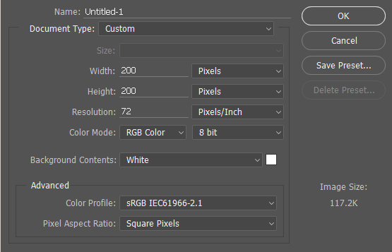
Create a new photoshop document with the following settings:
Now select the brush tool and select your foreground to black, with this done, open up your brush palette and select the "Star 70 Pixels" brush. This is the brush we'll using on our canvas soon.
Step 2 -
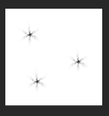
Click onto your canvas three times in different area's each time, if you'd like to, try to follow along with me as much as possible. Here is what i've done with the "Star 70 Pixels" brush.
Step 3 -
After this step we repeat it with a different brush and in four places. The brush we'll be using this time
will be the brush "Airbrush Soft Round 17", so find this in th brush palette.
What this will do is add a little variety and sparkle to your brush. Our next step will be more brush creating but this time using additional brushes hidden in the palette.
 Step 4 -
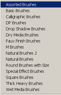
Open your brush palette and click on the small icon to the top right, this will bring down a drop-down menu where you can select different types of brushes, the brushes we want are called "Assorted Brushes". Click on this and then click "Append", this will then add them to your palette.
From here, find the brush called "Starburst - Small", it should be 50px and this is the next brush we'll be adding to our custom own created brush.
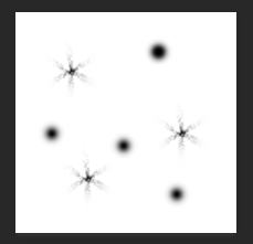
Like we did before, place it four different times on your canvas still using the black as our foreground colour.
How this looks can be seen here:
 Step 5 -
Now your brush is done, its time to define it as a new brush preset. To do this, go to Edit>Define Brush Preset and name your brush as "Sparkle Brush".
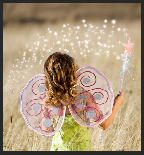
Your brush has been made and we're ready to start using it. The image i'm going to be using it in will be one provided to us but you can open up your own and use it where you would like to.
Step 6 -
Open up your image you want to add this brush to and create a new layer for the brush to be used on. Once this is done, change your foreground colour to white and select the brush we just made in the brush palette.
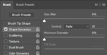
We're going to edit our brushes characteristics. First tick "Shape Dynamics" and now enter the following to what you see below.
 Step 7 -
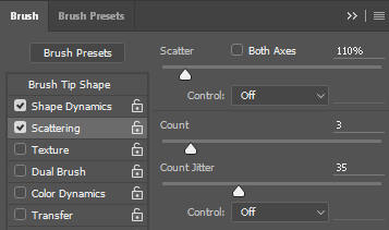
Now tick the "Scattering" option and in this tab use the following settings:
 Step 8 -
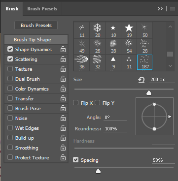
Our next step is to adjust the "Brush Tip Shape". Start by clicking on this in the menu bar to side where we found Scattering and Shape Dynamics. Once you've done this, input the following:
 Step 9 -
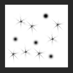
The brush is now complete and we're ready to start using it, what i suggest you to do is use the brush where you want but also pay attention to the size of it and in my case, I will be decreasing it over time.
 Step 10 -
Duplicate this layer for more editing, we're going to be adding a Gaussian Blur to the layer so with the newly duplicated layer head to Filter>Blur>Gaussian Blur, in this pop-up box, entera radius of 4.0 pixels.
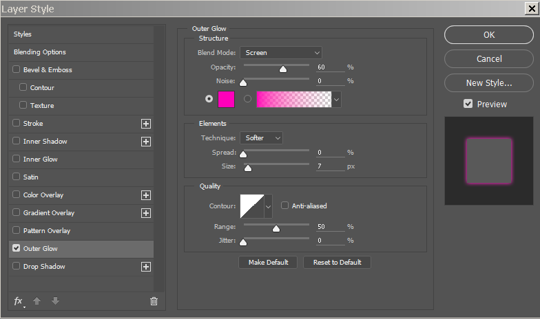
To make the sparkles we created really shine, we need to add an outer glow. Duplicate the layer you just Gaussian blurred and right click to blending options. From here, head to "Outer Glow" and input the following:
Your image is now complete. Here's a look of how mine turned out:

Step 1 -
Create a new photoshop document with the following settings:
Now select the brush tool and select your foreground to black, with this done, open up your brush palette and select the "Star 70 Pixels" brush. This is the brush we'll using on our canvas soon.
Step 2 -
Click onto your canvas three times in different area's each time, if you'd like to, try to follow along with me as much as possible. Here is what i've done with the "Star 70 Pixels" brush.
Step 3 -
After this step we repeat it with a different brush and in four places. The brush we'll be using this time
will be the brush "Airbrush Soft Round 17", so find this in th brush palette.
What this will do is add a little variety and sparkle to your brush. Our next step will be more brush creating but this time using additional brushes hidden in the palette.
Step 4 - Open your brush palette and click on the small icon to the top right, this will bring down a drop-down menu where you can select different types of brushes, the brushes we want are called "Assorted Brushes". Click on this and then click "Append", this will then add them to your palette.
From here, find the brush called "Starburst - Small", it should be 50px and this is the next brush we'll be adding to our custom own created brush.
Like we did before, place it four different times on your canvas still using the black as our foreground colour.
How this looks can be seen here:
Now your brush is done, its time to define it as a new brush preset. To do this, go to Edit>Define Brush Preset and name your brush as "Sparkle Brush".
Your brush has been made and we're ready to start using it. The image i'm going to be using it in will be one provided to us but you can open up your own and use it where you would like to.
Step 6 -
Open up your image you want to add this brush to and create a new layer for the brush to be used on. Once this is done, change your foreground colour to white and select the brush we just made in the brush palette.
We're going to edit our brushes characteristics. First tick "Shape Dynamics" and now enter the following to what you see below.
Now tick the "Scattering" option and in this tab use the following settings:
Our next step is to adjust the "Brush Tip Shape". Start by clicking on this in the menu bar to side where we found Scattering and Shape Dynamics. Once you've done this, input the following:
The brush is now complete and we're ready to start using it, what i suggest you to do is use the brush where you want but also pay attention to the size of it and in my case, I will be decreasing it over time.
Duplicate this layer for more editing, we're going to be adding a Gaussian Blur to the layer so with the newly duplicated layer head to Filter>Blur>Gaussian Blur, in this pop-up box, entera radius of 4.0 pixels.
To make the sparkles we created really shine, we need to add an outer glow. Duplicate the layer you just Gaussian blurred and right click to blending options. From here, head to "Outer Glow" and input the following:
Your image is now complete. Here's a look of how mine turned out:

How to Solarize images/How to create Solarized images
Solarisation is an effect used in photography which an image is turned into a negative. What is meant by this is that the image is wholly or sometimes partially reversed in tone or in much simpler words, Light becomes dark, dark becomes light.
This effect is impossibe to recreate with the use of a digital camera and must go through some editing software to be created. Programs like Photoshop already have a solarize filter (Filter > Stylize > Solarise) But to put it lightly, this function for the better part lacks in what a realistic version of the image would look like. Take it for yourself in this example shown here:
As you can see from this split screen effect i've created, the solarize function that photoshop has built in is quite rubbish, and that's trying to be nice about it.
So this post is dedicated to telling you how to solarize images properly and create something nice looking compared to the example seen on the left.
 First things first, items behind white backgrounds work a lot better for this but anything is fine. Now that's out of the way, make your image black and white, an easy way to do this is head to Layer > New adjustment Layer > Black & White.
Here I have created another comparison image to show the difference between my image and then the image being turned black and white.
Open Curves (CMD+M/CTRL+M) and click on the pen tool inside the interface to allow us to create our own line. Hold shift as you do this and click once on these values:
Now our image has been basically solarized but there's no reason to stop there, if you wish to do so though, that's up to you.

Here is my final image from using curves but i will show you what else i'd do to it to make it look a bit more cooler.
I want to add more curves onto this to bring out the darkness a bit more. You can also do this by opening up curves again (CMD+M/CTRL+M) and then also dragging and creating a slope downwards to your liking.
This effect is impossibe to recreate with the use of a digital camera and must go through some editing software to be created. Programs like Photoshop already have a solarize filter (Filter > Stylize > Solarise) But to put it lightly, this function for the better part lacks in what a realistic version of the image would look like. Take it for yourself in this example shown here:
As you can see from this split screen effect i've created, the solarize function that photoshop has built in is quite rubbish, and that's trying to be nice about it.
So this post is dedicated to telling you how to solarize images properly and create something nice looking compared to the example seen on the left.
Here I have created another comparison image to show the difference between my image and then the image being turned black and white.
Open Curves (CMD+M/CTRL+M) and click on the pen tool inside the interface to allow us to create our own line. Hold shift as you do this and click once on these values:
- Output - 0 Input - 0
- Output - 255 Input - 127
- Output - 0 Input - 255
Now our image has been basically solarized but there's no reason to stop there, if you wish to do so though, that's up to you.
Here is my final image from using curves but i will show you what else i'd do to it to make it look a bit more cooler.
I want to add more curves onto this to bring out the darkness a bit more. You can also do this by opening up curves again (CMD+M/CTRL+M) and then also dragging and creating a slope downwards to your liking.
 |
| Finished solarised image |
Creating a Rainbow Selfie
Creating a rainbow selfie is an extremely easy and 5 minute way to show your support for equal rights across all sexualities. It can be also be a way to show you support or are part of the LGBT community.
These are common and have been used throughout 2015 because of equal rights of all sexualities now being able to have a marriage together if they wish to or want to. To a lot of people this may not affect them, but to some couples, this is something they've been waiting for their entire lives. Since November of 2015, 14 different countries now support this and same sex marriages are legal, including countries such as America and England.
So, how do you create a rainbow selfie?
Well the process is really simple actually when using photoshop. Though social media like Facebook has this built in, and can palce this filter over a picture of yourself already, it's nice to create it yourself and be proud of something you made yourself.
We wont be using any tools for this except the transform tool to fit our LGBT pride flag to the canvas and over our picture. Because we'll be dealing with multiple layers, basic knowledge will apply as well as layer styles.
Step 1 -
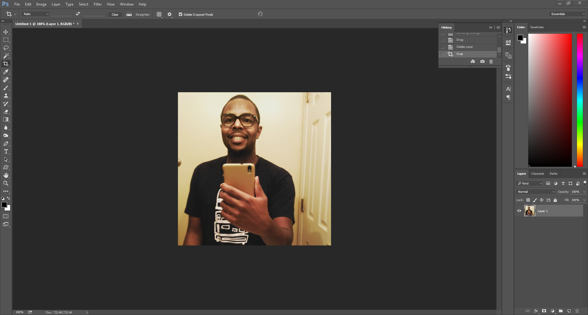 This step will bypass the fact and automatically assume you have a selfie of someone or yourself that you want to turn into a rainbow selfie. So skipping the selection part, open that selfie into photoshop. Here is a selfie I have put into photoshop. It's a simple drag and drop process or right-click then open with step.
Step 2 -
 Now we need to find an image of the LGBT pride flag on google. This can be created by yourself with the use of swatches and shape tools but there isn't really much of a need when it can be done in a much simpler way.
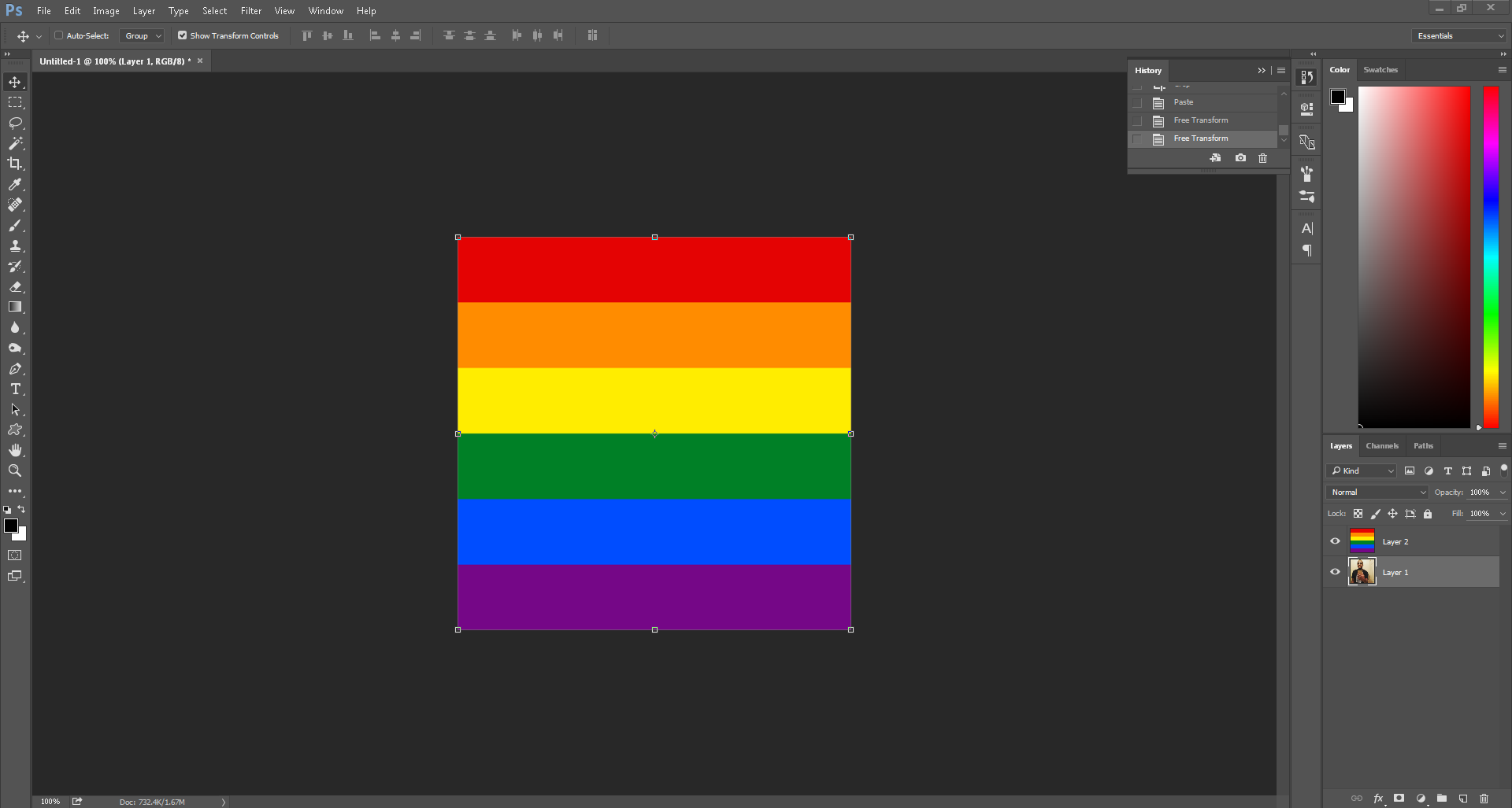
 Once you have the flag image, drag it into photoshop and it should appear above your selfie. Resize it to fit the canvas and make sure every part of the flag is seeable, it doesn't matter if you resize to scale or not because the image is literally just solid blocks of colour.
Step 3 -
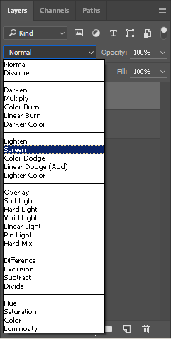
Step 3 is actually the last part in this simple and quick tutorial and all this requires us to do is use a layer style. To do this, notice where it says "Normal" on your layers tab and click it. A drop down menu will appear which you can select different styles/overlays.
Select "Screen" and this will apply it over your selfie lightly. If it doesn't look how you'd like it, try reduce the opacity a little to get the desired look you want.
Final Image -

These are common and have been used throughout 2015 because of equal rights of all sexualities now being able to have a marriage together if they wish to or want to. To a lot of people this may not affect them, but to some couples, this is something they've been waiting for their entire lives. Since November of 2015, 14 different countries now support this and same sex marriages are legal, including countries such as America and England.
So, how do you create a rainbow selfie?
Well the process is really simple actually when using photoshop. Though social media like Facebook has this built in, and can palce this filter over a picture of yourself already, it's nice to create it yourself and be proud of something you made yourself.
We wont be using any tools for this except the transform tool to fit our LGBT pride flag to the canvas and over our picture. Because we'll be dealing with multiple layers, basic knowledge will apply as well as layer styles.
Step 1 -
This step will bypass the fact and automatically assume you have a selfie of someone or yourself that you want to turn into a rainbow selfie. So skipping the selection part, open that selfie into photoshop. Here is a selfie I have put into photoshop. It's a simple drag and drop process or right-click then open with step.Step 2 -
Now we need to find an image of the LGBT pride flag on google. This can be created by yourself with the use of swatches and shape tools but there isn't really much of a need when it can be done in a much simpler way.Once you have the flag image, drag it into photoshop and it should appear above your selfie. Resize it to fit the canvas and make sure every part of the flag is seeable, it doesn't matter if you resize to scale or not because the image is literally just solid blocks of colour.Step 3 -
Step 3 is actually the last part in this simple and quick tutorial and all this requires us to do is use a layer style. To do this, notice where it says "Normal" on your layers tab and click it. A drop down menu will appear which you can select different styles/overlays.
Select "Screen" and this will apply it over your selfie lightly. If it doesn't look how you'd like it, try reduce the opacity a little to get the desired look you want.
Final Image -

Creating a Ministry of Sound Album Cover
In this tutorial I learnt how to create a Ministry of Sound album cover from scratch, this involved adding my own text, creating my own background and building it from the ground up and a blank canvas.
To start, I created a new blank canvas on photo shop as seen here:

This includes the exact dimensions used in covers for albums in a CD Jewel case. Without these exact dimensions, if i was to insert this front cover into a case it would either be too big and not fit or too small and leave gaps along the top, bottom, or sides.
After these dimensions had all been set and double checked to be correct, I pressed 'Okay' and proceeded onto the next stage.

My next stage was to include the text of this album cover.
Here I've used a Helvetica normal font at a 48pt size and written in ALL CAPS. All letters being capitalised makes your text a lot clearer and also naturally more bolder and more eye catching to the viewer as a whole.
Altering the leading was not needed because all three pieces of text are on a different layer. This allowed for myself to adjust the leading to my liking freely before being happy with it and moving onto the next step of creating a smart object out of the three pieces of text.

This gif shows me highlighting the three pieces of text and then creating a smart object out of them. The reason I join all three pieces of text together and then convert them into a smart object is because smart objects are directly editable.
Because they're now a smart object, that means any editing I do in masks or layers which I clip onto the text will stick and adapt to whatever I wish to change the text to. For example, if I wanted to change my text after I had finished the album cover or a company required me to change the text of the albums name, I would be able to do so without any issues or needing re-do all the editing over again. It would just adapt and change accordingly to whatever I put in place of the text.
 In this next transition, i have added paint splats along and across letters individually, this was done using a mask for the smart object text though.
I have done this because if it wasn't on a layer mask and was on the actual text, I'd be taking chunks out of the actual text compared to actually making it seem like i have taken chunks out but have actually just hidden those pieces away.
The brushes to mask away bits of the text in splattered effect can be found on:
http://www.brusheezy.com/
or, as a direct link
http://www.brusheezy.com/brushes/1390-high-res-splatter-brushes
 Now I want to create an effect on the text I'm using in my piece.
To start of, I create and new layer and convert it to a smart object immediately. Then I head over to the following ling across the drop-down menu options.
Filter > Render > Clouds
This creates a cloudy effect over my entire canvas, but this isn't want i want exactly, i want it to be only inside of the text and make the text look slightly cloudy or misty as so to speak.
I do this by holding alt between both the cloudy smart object I just created and the text smart object below that. This makes it so i have applied the above layer (my cloud layer to my text layer and thus applies the cloudy effect in my text.
 After I've applied the cloudy smart object to the text layer, I want to make it look more darker and bolder within the text, i achieve this by using levels which is opened by pressing CMD+L on a Mac or CTRL+L on windows. Levels does roughly the same as what curves do when you open and edit your picture with that. With levels I can control the how bright something is, how dark it is and the mid-tones of the image on a gradient scale of black to white.
Here I have inputted the following:

My next step is to add an overlay to the cloudy texture. I decided on giving my text a nice blue shine, so to do this, I created a Hue/Saturation overlay.
Changing the hue or saturation of something means that your image will look different depending on what you do, hue changes the colour of your image using HSL and HSV cylindrical-coordinate representations. These are what ultimately determines the colour in your RGB colour model.
Saturation uses the same as hue as in, the same cylindrical-coordinate representations are used. The different between them both is that saturation is determined by light intensity and how much its been distributed across a spectrum of different wave lengths. The lower the value the less colour your image has, the higher the value, the more saturated and colourful your image is.
This overlay will effect all layers under it, so everything I do under the overlay will appear as the blue I've set. This happens regardless of what I place or use underneath it. From here I did the following:

Doing this provided my text with the 'blue-ish' cloudy text. This looks fine as it is but I want to take it a step further, I want to created a slashed and smashed effect to the text and make it look its been dropped onto the black background. This will be done using the line tool to create the slashed effect and to create the bits of broken text, I will be creating my own brush to do this effect.
Creating a slashed effect through the text -
To create the slashed effect in my text, I will be using several different techniques and tools including ones used before such as smart objects and masks.
My first step in creating the effect of slashed text will be done using the pen tool. The pen tool allows me to create straight lines in any desired angle and weight I like. Adjusting the weight changes how thick or wide the straight line is and holding ALT and pulling in a certain direction either creates a 45 degree angle, 180 degree angle and so fourth.
In this image you can see that i have created lines 45 degree lines all across my text but have hidden my text to show off exactly how it looks.
 From this image I convert it to a smart object from a shape layer and clip it onto the layer below which would be my text smart object and mask. This makes it so that when the lines of the image above hit the text and go through it, it creates a slashed through effect when coupled with the use displacing the clipped layer under Filter > Distort > Displace. This effect can be seen here, note that the hue/saturation layer applies to this too though as its above everything we've done so far.
I'm with this result and will now proceed onto my next step which will be creating a small smashed effect on my text, to imitate the action of the text hitting the back ground. This will be done using brushes.
Creating the smashed effect via brush creating:

These images show my step by step process of how I created the brush I'll be using to create my smashed effect.
I started with a size 5, round and fully hard brush which can be found in the brush presets. Then, inside the brush properties I enabled 'smoothing'. The angle and spacing of the brush has been left untouched because it isn't needed to be changed.
After this, I went into the shape dynamics of the brush. I want the strokes of my brush to be spaced apart from each other and jittered enough that it looks as if its randomised though.
These settings achieve this affect:
The final part to my in creating my own brush, my first step is to adjust the scattering, the scattering changes how spaced and spread out all of the individual specs in my brush are. How scattered you can create your brush relies on a scale from 0-1000%, I played around with this back and fourth and found that between 900-1000% is best. Personally, I've chosen 911% with a count jitter of 100%.
This a small snippet of what I've used for the brush for, notice the small specs falling from the letter S as if they've come off of the letter.
 Now its time to create a background for the text to sit on. This is done in the same way that we made the slash effect except this time the lines will be thicker (5-10pt weight) and different shades of grey. These later will be coloured with a soft brush as well as smudged after some masking work.
I did the same as i did before, holding ALT and pulling using the pen tool to create the different lines across my text. Once again though, i have hidden every single layer but the background to show this off and make it as visible as possible so you can see what i've done.
 After I had created different lines going in a 45 degree angle across my page in a way I liked, I added a layer mask. The layer mask is there for hiding parts of the lines with my splatter brushes again. Just like I did earlier with my text.
Before using my splatter brushes though, I needed to use the smudge tool with a large and soft round brush. This brush made it so I can warp and distort my lines as if they're paint strokes to a certain degree.
Once this was done, it was now time to add the paint splats to the smudged lines like with my text, on a layer mask, and smart object. The brushes needed to be a lot smaller this time though, to capture small fine details along the lines and to make sure i didn't get rid of a large chunk of a line.
I found this part a little difficult because of the fact of using huge brushes and reducing their size to something extremely small when compared to its preset.
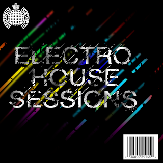 This goes underneath everything we've done so far along with a coloured gradient overlay for times sake. I then later touched it up with fading the top and bottom half of the lines created. Whilst this is good, It was time to finish it up with a Barcode and Logo of Ministy of Sound. This can be seen here.
To start, I created a new blank canvas on photo shop as seen here:

This includes the exact dimensions used in covers for albums in a CD Jewel case. Without these exact dimensions, if i was to insert this front cover into a case it would either be too big and not fit or too small and leave gaps along the top, bottom, or sides.
After these dimensions had all been set and double checked to be correct, I pressed 'Okay' and proceeded onto the next stage.

My next stage was to include the text of this album cover.
Here I've used a Helvetica normal font at a 48pt size and written in ALL CAPS. All letters being capitalised makes your text a lot clearer and also naturally more bolder and more eye catching to the viewer as a whole.
Altering the leading was not needed because all three pieces of text are on a different layer. This allowed for myself to adjust the leading to my liking freely before being happy with it and moving onto the next step of creating a smart object out of the three pieces of text.

This gif shows me highlighting the three pieces of text and then creating a smart object out of them. The reason I join all three pieces of text together and then convert them into a smart object is because smart objects are directly editable.
Because they're now a smart object, that means any editing I do in masks or layers which I clip onto the text will stick and adapt to whatever I wish to change the text to. For example, if I wanted to change my text after I had finished the album cover or a company required me to change the text of the albums name, I would be able to do so without any issues or needing re-do all the editing over again. It would just adapt and change accordingly to whatever I put in place of the text.

I have done this because if it wasn't on a layer mask and was on the actual text, I'd be taking chunks out of the actual text compared to actually making it seem like i have taken chunks out but have actually just hidden those pieces away.
The brushes to mask away bits of the text in splattered effect can be found on:
http://www.brusheezy.com/
or, as a direct link
http://www.brusheezy.com/brushes/1390-high-res-splatter-brushes

To start of, I create and new layer and convert it to a smart object immediately. Then I head over to the following ling across the drop-down menu options.
Filter > Render > Clouds
This creates a cloudy effect over my entire canvas, but this isn't want i want exactly, i want it to be only inside of the text and make the text look slightly cloudy or misty as so to speak.
I do this by holding alt between both the cloudy smart object I just created and the text smart object below that. This makes it so i have applied the above layer (my cloud layer to my text layer and thus applies the cloudy effect in my text.

Here I have inputted the following:
- First input - 0
- Second input - 1
- Third input - 146

My next step is to add an overlay to the cloudy texture. I decided on giving my text a nice blue shine, so to do this, I created a Hue/Saturation overlay.
Changing the hue or saturation of something means that your image will look different depending on what you do, hue changes the colour of your image using HSL and HSV cylindrical-coordinate representations. These are what ultimately determines the colour in your RGB colour model.
Saturation uses the same as hue as in, the same cylindrical-coordinate representations are used. The different between them both is that saturation is determined by light intensity and how much its been distributed across a spectrum of different wave lengths. The lower the value the less colour your image has, the higher the value, the more saturated and colourful your image is.
This overlay will effect all layers under it, so everything I do under the overlay will appear as the blue I've set. This happens regardless of what I place or use underneath it. From here I did the following:
- Hue - 204
- Saturation - 33
- Lightness - 0

Doing this provided my text with the 'blue-ish' cloudy text. This looks fine as it is but I want to take it a step further, I want to created a slashed and smashed effect to the text and make it look its been dropped onto the black background. This will be done using the line tool to create the slashed effect and to create the bits of broken text, I will be creating my own brush to do this effect.
Creating a slashed effect through the text -
 |
| Lines created using the pen tool (2-5pt) |
My first step in creating the effect of slashed text will be done using the pen tool. The pen tool allows me to create straight lines in any desired angle and weight I like. Adjusting the weight changes how thick or wide the straight line is and holding ALT and pulling in a certain direction either creates a 45 degree angle, 180 degree angle and so fourth.
In this image you can see that i have created lines 45 degree lines all across my text but have hidden my text to show off exactly how it looks.

I'm with this result and will now proceed onto my next step which will be creating a small smashed effect on my text, to imitate the action of the text hitting the back ground. This will be done using brushes.
Creating the smashed effect via brush creating:

These images show my step by step process of how I created the brush I'll be using to create my smashed effect.
I started with a size 5, round and fully hard brush which can be found in the brush presets. Then, inside the brush properties I enabled 'smoothing'. The angle and spacing of the brush has been left untouched because it isn't needed to be changed.
After this, I went into the shape dynamics of the brush. I want the strokes of my brush to be spaced apart from each other and jittered enough that it looks as if its randomised though.
These settings achieve this affect:
- Size jitter - 100%
- Control - Pen Pressure
- Angle jitter - 100%
- Roundness jitter - 100%
- Minimum jitter - 1%
The final part to my in creating my own brush, my first step is to adjust the scattering, the scattering changes how spaced and spread out all of the individual specs in my brush are. How scattered you can create your brush relies on a scale from 0-1000%, I played around with this back and fourth and found that between 900-1000% is best. Personally, I've chosen 911% with a count jitter of 100%.
This a small snippet of what I've used for the brush for, notice the small specs falling from the letter S as if they've come off of the letter.

I did the same as i did before, holding ALT and pulling using the pen tool to create the different lines across my text. Once again though, i have hidden every single layer but the background to show this off and make it as visible as possible so you can see what i've done.

Before using my splatter brushes though, I needed to use the smudge tool with a large and soft round brush. This brush made it so I can warp and distort my lines as if they're paint strokes to a certain degree.
Once this was done, it was now time to add the paint splats to the smudged lines like with my text, on a layer mask, and smart object. The brushes needed to be a lot smaller this time though, to capture small fine details along the lines and to make sure i didn't get rid of a large chunk of a line.
I found this part a little difficult because of the fact of using huge brushes and reducing their size to something extremely small when compared to its preset.
 This goes underneath everything we've done so far along with a coloured gradient overlay for times sake. I then later touched it up with fading the top and bottom half of the lines created. Whilst this is good, It was time to finish it up with a Barcode and Logo of Ministy of Sound. This can be seen here.
Subscribe to:
Comments (Atom)