To start, I created a new blank canvas on photo shop as seen here:

This includes the exact dimensions used in covers for albums in a CD Jewel case. Without these exact dimensions, if i was to insert this front cover into a case it would either be too big and not fit or too small and leave gaps along the top, bottom, or sides.
After these dimensions had all been set and double checked to be correct, I pressed 'Okay' and proceeded onto the next stage.

My next stage was to include the text of this album cover.
Here I've used a Helvetica normal font at a 48pt size and written in ALL CAPS. All letters being capitalised makes your text a lot clearer and also naturally more bolder and more eye catching to the viewer as a whole.
Altering the leading was not needed because all three pieces of text are on a different layer. This allowed for myself to adjust the leading to my liking freely before being happy with it and moving onto the next step of creating a smart object out of the three pieces of text.

This gif shows me highlighting the three pieces of text and then creating a smart object out of them. The reason I join all three pieces of text together and then convert them into a smart object is because smart objects are directly editable.
Because they're now a smart object, that means any editing I do in masks or layers which I clip onto the text will stick and adapt to whatever I wish to change the text to. For example, if I wanted to change my text after I had finished the album cover or a company required me to change the text of the albums name, I would be able to do so without any issues or needing re-do all the editing over again. It would just adapt and change accordingly to whatever I put in place of the text.

I have done this because if it wasn't on a layer mask and was on the actual text, I'd be taking chunks out of the actual text compared to actually making it seem like i have taken chunks out but have actually just hidden those pieces away.
The brushes to mask away bits of the text in splattered effect can be found on:
http://www.brusheezy.com/
or, as a direct link
http://www.brusheezy.com/brushes/1390-high-res-splatter-brushes

To start of, I create and new layer and convert it to a smart object immediately. Then I head over to the following ling across the drop-down menu options.
Filter > Render > Clouds
This creates a cloudy effect over my entire canvas, but this isn't want i want exactly, i want it to be only inside of the text and make the text look slightly cloudy or misty as so to speak.
I do this by holding alt between both the cloudy smart object I just created and the text smart object below that. This makes it so i have applied the above layer (my cloud layer to my text layer and thus applies the cloudy effect in my text.

Here I have inputted the following:
- First input - 0
- Second input - 1
- Third input - 146

My next step is to add an overlay to the cloudy texture. I decided on giving my text a nice blue shine, so to do this, I created a Hue/Saturation overlay.
Changing the hue or saturation of something means that your image will look different depending on what you do, hue changes the colour of your image using HSL and HSV cylindrical-coordinate representations. These are what ultimately determines the colour in your RGB colour model.
Saturation uses the same as hue as in, the same cylindrical-coordinate representations are used. The different between them both is that saturation is determined by light intensity and how much its been distributed across a spectrum of different wave lengths. The lower the value the less colour your image has, the higher the value, the more saturated and colourful your image is.
This overlay will effect all layers under it, so everything I do under the overlay will appear as the blue I've set. This happens regardless of what I place or use underneath it. From here I did the following:
- Hue - 204
- Saturation - 33
- Lightness - 0

Doing this provided my text with the 'blue-ish' cloudy text. This looks fine as it is but I want to take it a step further, I want to created a slashed and smashed effect to the text and make it look its been dropped onto the black background. This will be done using the line tool to create the slashed effect and to create the bits of broken text, I will be creating my own brush to do this effect.
Creating a slashed effect through the text -
 |
| Lines created using the pen tool (2-5pt) |
My first step in creating the effect of slashed text will be done using the pen tool. The pen tool allows me to create straight lines in any desired angle and weight I like. Adjusting the weight changes how thick or wide the straight line is and holding ALT and pulling in a certain direction either creates a 45 degree angle, 180 degree angle and so fourth.
In this image you can see that i have created lines 45 degree lines all across my text but have hidden my text to show off exactly how it looks.

I'm with this result and will now proceed onto my next step which will be creating a small smashed effect on my text, to imitate the action of the text hitting the back ground. This will be done using brushes.
Creating the smashed effect via brush creating:

These images show my step by step process of how I created the brush I'll be using to create my smashed effect.
I started with a size 5, round and fully hard brush which can be found in the brush presets. Then, inside the brush properties I enabled 'smoothing'. The angle and spacing of the brush has been left untouched because it isn't needed to be changed.
After this, I went into the shape dynamics of the brush. I want the strokes of my brush to be spaced apart from each other and jittered enough that it looks as if its randomised though.
These settings achieve this affect:
- Size jitter - 100%
- Control - Pen Pressure
- Angle jitter - 100%
- Roundness jitter - 100%
- Minimum jitter - 1%
The final part to my in creating my own brush, my first step is to adjust the scattering, the scattering changes how spaced and spread out all of the individual specs in my brush are. How scattered you can create your brush relies on a scale from 0-1000%, I played around with this back and fourth and found that between 900-1000% is best. Personally, I've chosen 911% with a count jitter of 100%.
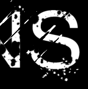
This a small snippet of what I've used for the brush for, notice the small specs falling from the letter S as if they've come off of the letter.

I did the same as i did before, holding ALT and pulling using the pen tool to create the different lines across my text. Once again though, i have hidden every single layer but the background to show this off and make it as visible as possible so you can see what i've done.

Before using my splatter brushes though, I needed to use the smudge tool with a large and soft round brush. This brush made it so I can warp and distort my lines as if they're paint strokes to a certain degree.
Once this was done, it was now time to add the paint splats to the smudged lines like with my text, on a layer mask, and smart object. The brushes needed to be a lot smaller this time though, to capture small fine details along the lines and to make sure i didn't get rid of a large chunk of a line.
I found this part a little difficult because of the fact of using huge brushes and reducing their size to something extremely small when compared to its preset.
 This goes underneath everything we've done so far along with a coloured gradient overlay for times sake. I then later touched it up with fading the top and bottom half of the lines created. Whilst this is good, It was time to finish it up with a Barcode and Logo of Ministy of Sound. This can be seen here.
No comments:
Post a Comment